Blog
How I Turned Someone Else’s Viral Carousel Into My Own
A real before-and-after. I took a carousel that got 18.3× its creator’s usual engagement, kept the format, changed the subject, and got 3K+ likes in 3 days.
Most advice about carousels is a list of rules. This is one carousel I made, what I copied, what I didn’t, and why it worked.
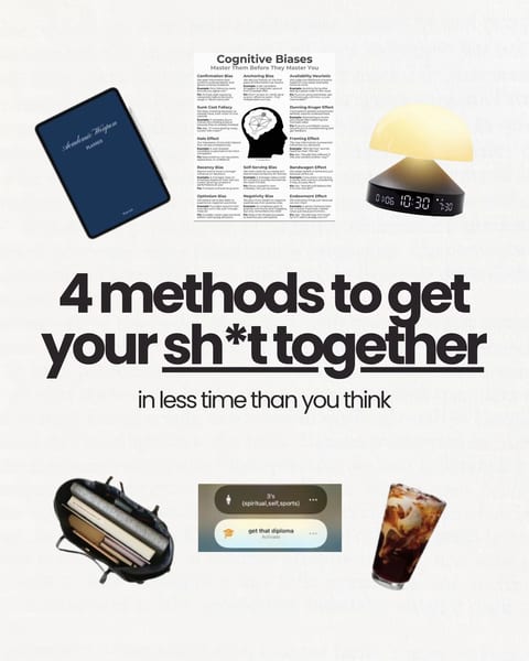 18.3× her usual · 3.3K likes@themiagabriella
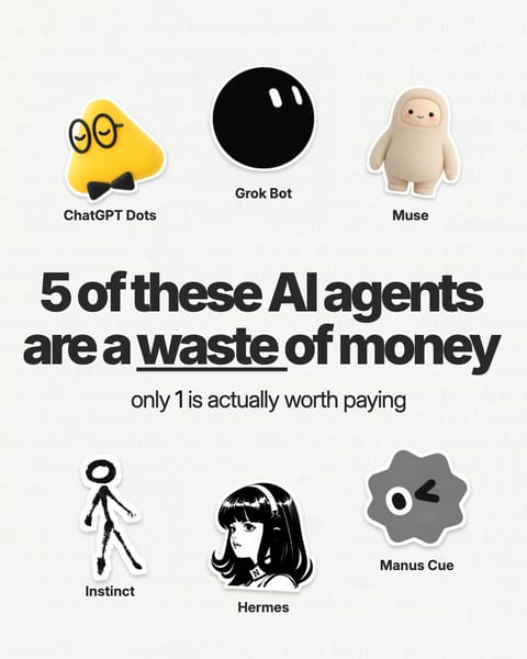 3K+ likes in 3 days
The outlier I found
I was browsing the Top Carousels library when I found a carousel by @themiagabriella. The first slide said “4 methods to get your sh*t together”, with a handful of everyday objects arranged around a big centred headline and one underlined word.
It had 3.3K likes. That’s a nice number, but on its own it says nothing. What made me stop was the score: 18.3× her usual. Her other carousels around that time got a fraction of that engagement, so something about this post worked far better than her normal content. Same account, same followers, very different result.
That’s the difference between a big number and an outlier. A huge account can post something average and still get 50K likes. A carousel that does 18× its creator’s usual tells you the post did something right. If you want to know how that score is worked out, I wrote it up in what an outlier carousel is.
What I kept
I didn’t want her topic. I wanted the shape of the post. Looking at the slides, three things were doing the work:
- A big centred hook. One short sentence, large enough to read in the feed thumbnail.
- Objects arranged around the hook. The objects gave the eye something to scan and made the slide feel like a curated set rather than a wall of text.
- One underlined word. It told you where the tension was before you’d finished reading.
That’s the format. It has nothing to do with productivity, which was her subject. It would work for almost any “here are N things” idea.
What I changed
My niche is AI tools, so I kept the layout and wrote about something my audience argues about: paying for AI agents. The first slide became “5 of these AI agents are a waste of money”, with waste underlined, a line underneath saying only 1 is actually worth paying, and the agents’ mascots placed around the headline where her objects had been.
Everything else was mine: the subject, the opinion, the examples on each slide and the ending. Nobody looking at the two posts side by side would call mine a copy. They would say it uses the same kind of first slide, which is the point.
The result
My version got 3K+ likes in 3 days. For my account that was well above normal, and it came from a structure I hadn’t invented. I just recognised it as one that had already worked.
How to do the same thing
You can repeat this with any carousel in the library. Here’s the process I use now.
1. Find a reference with a high score, not just big numbers
Filter by outlier score instead of likes. A 5× carousel from a 20K account is a better reference than a 1.1× post from a celebrity, because it shows what beat the baseline. Browse by niche to start: business, content creation, AI & tech or design.
2. Pick it for its structure, not its subject
Ask what you’d keep if you removed the topic entirely. Usually it’s one of these:
- the first-slide pattern (a number, a contrarian fact, a confession, a “vs”)
- the layout (a big centred hook, a photo grid, a single object)
- the slide count and how much text each slide carries
- how the last slide ends (a recap, a question, a reason to save)
If you can’t name the structure, it’s not a good reference for you, however well it did.
3. Write your version about your world
Keep the skeleton and replace everything on it: your subject, your opinion, your examples and your voice. Don’t reuse their images, phrasing or slides. Borrowing a format is how every genre works. Copying a post is not.
4. Draft the copy before you design
Get every slide’s text right first, then design. It’s much faster to rewrite a sentence than to redo a slide. In Top Carousels, Make it your own gives you the reference slides and a ready-made prompt. Attach the slides to a new ChatGPT or Claude chat, paste the prompt, then add your subject, audience and examples. The assistant drafts the copy first and waits for your OK before it designs anything. Check the facts before you post.
5. Post it and compare it with your own usual
Judge your version against your normal results, not against the original’s numbers. If your carousels usually get 300 likes and this one gets 900, it worked: 3× your usual. Then go back and find the next reference.
Why this works
A format that outperformed once has already passed a test: real people stopped, swiped and engaged. You’re not guessing whether a structure can hold attention, only whether your idea is good. That’s a much better bet than starting from a blank page.
It also explains something we see in the library all the time. The first slide “The average millionaire is 57. Not 23.” appears on two different accounts. It scored 90.1× for @creatorkarro and 18.8× for @danmartell. The same pattern worked twice, on two different audiences.
Outliers you could start with today
A few rules I stick to
- Credit when you borrow something specific. If your post leans on someone’s idea or research, tag them.
- Never reuse their images or slides. Make your own visuals, even if the layout is similar.
- Remix the structure, not the person. If a creator’s whole identity is their visual style, pick a different reference.
- One reference per post. Mixing three formats usually gives you none of them.
Frequently asked questions
Is it OK to copy a viral carousel?
Copying a post is not OK. Reusing its structure is how every format works. Keep the skeleton (the first-slide pattern, the layout, the slide count) and replace the subject, wording, images and examples with your own. Credit the creator if you borrow a specific idea.
How do I find a carousel worth remixing?
Look for a high outlier score rather than high likes. A carousel that did 5× its creator’s usual tells you the post itself worked, whatever the account size. Browse outliers by niche or format and pick one whose structure fits an idea you already have.
How long does it take to remix a carousel?
With a clear reference and the copy drafted first, most people can write and design a remix in an hour or two. The slow part is choosing the idea; the structure is already proven.